Part of our series for Jihadica on the Jihadi Twitter phenomenon, Ali Fisher and Nico Prucha took a closer look at 66 Twitter accounts recommended by a Jihadi online forum user.
We produced this infographic, and an interactive network map. These were translated into Arabic and posted on a forum, news of which spread rapidly on Twitter using the #tag, #دراسة_أمريكية_أخطر_66_حساب_جهادي.
Tracking the spread of this information provides a useful insight into the relational dynamics, spread of information, and some influential users within the Jihadi Twitter phenomenon.
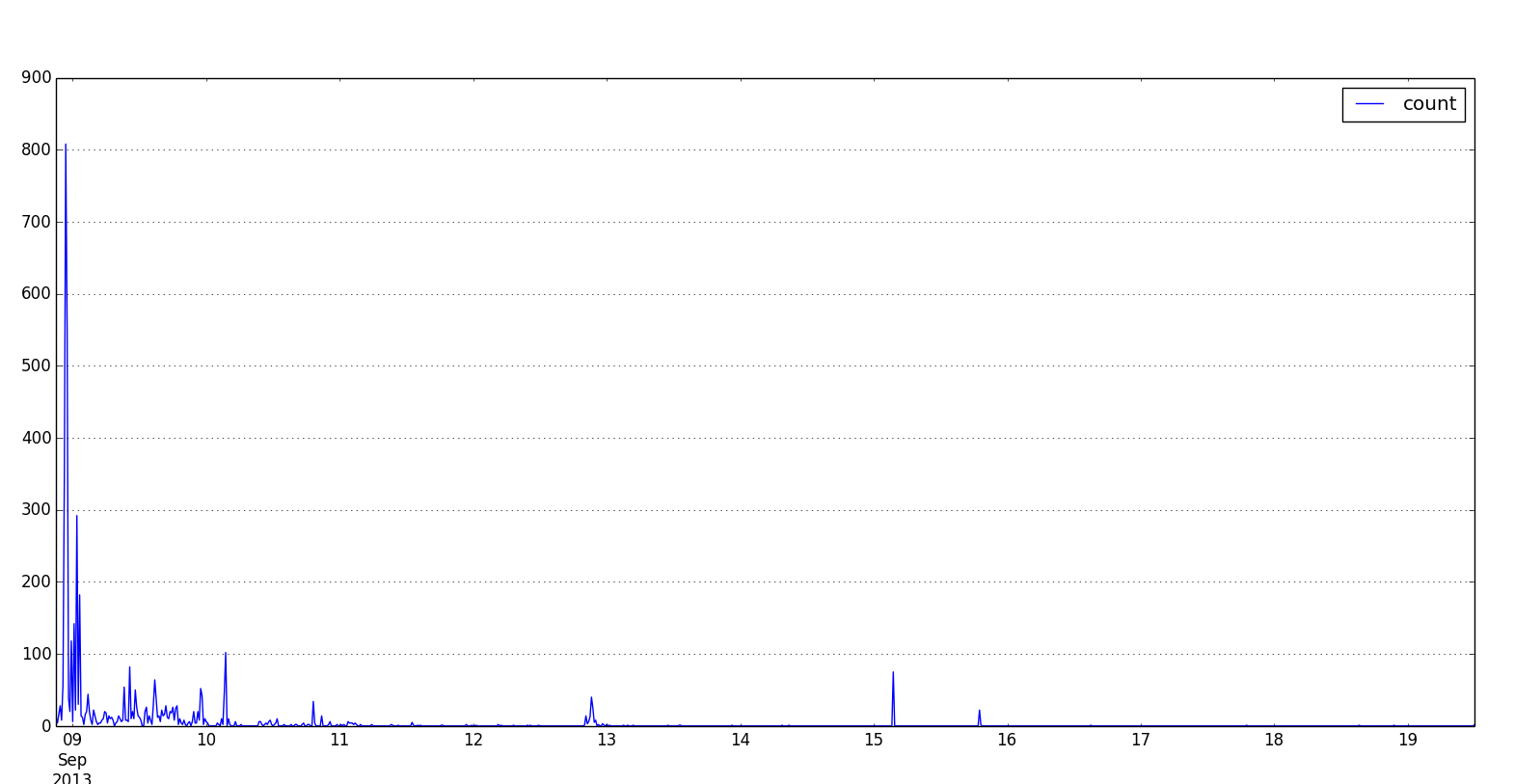
The graph shows volume of tweets containing the #tag for each 15 minute period. This indicates that news travels fast, reaching most of the users it would reach within the first day. It highlights the speed of information dissemination within this network. A few users were particularly important in spreading the news:
These are the users most frequently retweeted within our data.

In addition to the volume of retweets, time is also a factor as not users were retweeted / mentioned at different times. This is known as an engagement profile, as it shows when users were particularly important.
It also highlights that prominent users are retweeted rapidly – if observed in numerous contexts this would indicate information is travelling faster than current case-by-case counter-strategies can respond.
To gain greater insight into the way information travelled, key actor analysis can differentiate those users that are important for reaching specific communities, from those users that are part of the core of the network. This is useful because not all users were retweeted / mentioned at the same time nor were they influential in the same way.
Position on the scatter plot below is based on pagerank and betweenness. Size is the number of times the account was retweeted or mentioned. Colour shows the number of followers the user has (blue, lowest, to red, highest). Mouse over dots to show labels.
• Users in the bottom left of the graph tend to have no particular role and can be thought of as general users, although they may have high value to an often small and very specific group.
• Those in the top left of the graph tend to be in the core (or one of the cores) of the network. This indicates they are often those most invested in the network and have access to privileged information.
• Those in the bottom right of the graph fulfil the role of bridging between the core content producers and a specific community. The value of this role often comes from tailoring information to a specific ‘audience’ and as such these users are more valuable to that group but less important to everyone else.
• Users in the top right are rare. They have a dual function, as they have the same trusted status as those in the top left of the graph. They also fulfil the same ‘bridge’ role as users in the bottom right of the graph, reaching areas of the network which others do not.
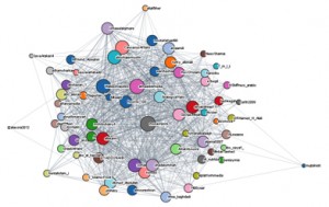
Viewing the network map can show which users communicated with each other, which reached the same communities, and which were a bridge to specific communities. (If the graph is blank, try reloading the page or view full screen).
View full screen here. Colours show the different interconnected communities, note the green cluster of interconnected users in the middle of the network. This highlights the likely resilience of the core of the community on twitter, in addition to the resilience created by the multiplatform zeitgiest identified here.
An alternative view of the network highlights the interconnection within the core of the network and shows the users that are important bridges to communities of users. Here colour is used for Betweenness (Red low, Yellow mid, Green high), larger size reflects higher indegree (showing the number of times retweeted). Notice how the yellow nodes are often part of the inner circle and connected to a group outside the inner circle. This emphasises their bridging role, propagating this material to a wider audience.
Click or scroll over the image to zoom. Alternatively to view full screen click here.
Visualisation created from the GDELT data set using Python, Torque, and CartoDB
This graphic was developed as part of the follow-up the the assessment 66 accounts listed by Shumukh al-Islam jihadi Forum member Ahmad ‘Abdallah as ‘important jihadist’ members on twitter.
In this follow-up piece we sought to find out about these accounts as a group and provide an interactive network map to show the links between these ‘important jihadist’ twitter accounts.
The full post is available on Jihadica, here
An interactive version of this network map showing the links between 66 ‘important jihadist’ twitter accounts is available here
This graphic was originally published as part of a series of posts on Jihadica analysing a post on the Shumukh al-Islam forum recently which provided a “Twitter Guide” (dalil Twitter).
This ‘guide’ outlined reasons for using Twitter as an important arena of the electronic ribat; identified the different types of accounts which users could follow; and highlighted 66 users which Ahmad ‘Abdallah termed “The most important jihadi and support sites for jihad and the mujahideen on Twitter”.
The original post is available here
